
For most parish accounts, the safe defaults are Instagram feed at 1080×1350 (4:5) with content kept inside a centered safe zone, Stories and Reels at 1080×1920 (9:16), YouTube thumbnails at 1280×720, Facebook feed images at 1200×630, and profile photos at 320×320. Build every master file at double that pixel size, then export down to the target dimensions. That single habit prevents the blurry, stretched graphics that quietly undermine a church's credibility online.
TL;DR:
- Designing images at twice the final pixel dimensions helps prevent blurriness and distortion after platform compression or cropping.
- Instagram profile previews crop at a 3:4 aspect ratio, so content must stay within a centered 1012-pixel width to avoid being cut off.
- Facebook, X, and LinkedIn images should be sized around 1200×630 to 1200×675 pixels for optimal display and minimal cropping on each platform.
- YouTube thumbnails should be 1280×720 pixels, with channel banners at 2560×1440, ensuring safe areas for logos and text across devices.
- Using pre-built templates with centered safe zones streamlines social media content creation and maintains consistent, professional visuals.
Table of Contents
- What Are the Right Church Social Media Sizes for Every Platform?
- How Should Churches Size Instagram Posts and Carousels?
- What Sizes Work Best for Facebook, X, and LinkedIn?
- What Are the Right Video and Thumbnail Sizes for YouTube and Shorts?
- How Should Church Teams Export and Compress Their Graphics?
- How Do Churches Apply Safe Zones and Admin Practices Consistently?
- Why Consistent Sizes Matter More Than People Think
- BNJMN Digital Kits Built Around These Exact Sizes
- Sources
- FAQ
What Are the Right Church Social Media Sizes for Every Platform?
Print this table and tape it above the volunteer computer. It covers the platforms most churches actually use, with the pixel dimensions and aspect ratios that survive uploads without distortion.
Design every asset at 2× the final export size, then scale down. That keeps text and logos sharp after a platform recompresses your upload. The one change worth flagging for church teams specifically: Instagram now crops profile grid previews to 3:4, even though the feed itself still displays posts at 4:5. Design for the wider ratio, but keep your sermon title or event date inside the narrower crop, or it disappears the moment someone taps your profile.
How Should Churches Size Instagram Posts and Carousels?
Instagram is where most churches lose the most quality, mainly because a single mistake (uploading a 1:1 square when the algorithm favors portrait) gets repeated for years. The current practical default is 1080×1350 pixels at a 4:5 ratio, which gives you more vertical real estate in the feed than a square post without tipping into Stories territory.
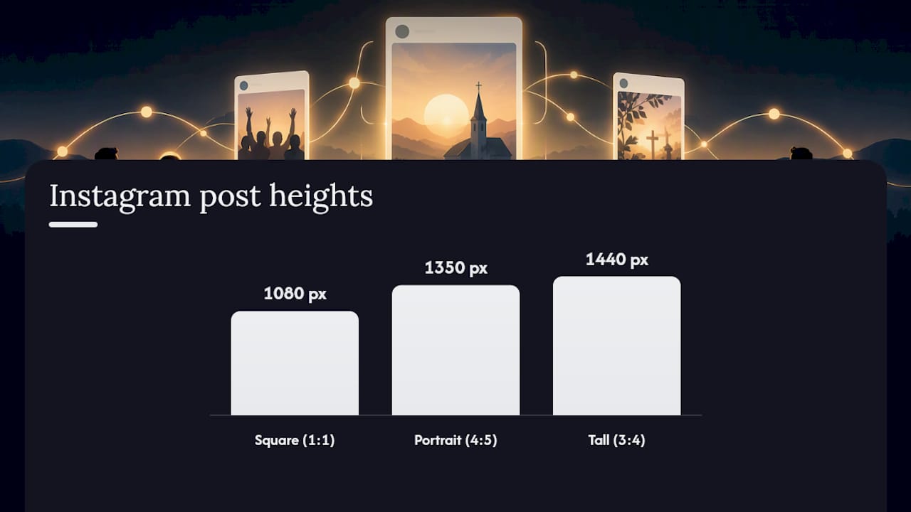
The complication is the grid. When someone visits your church's profile, Instagram crops every post preview to 3:4, roughly the center 1012 pixels of width on a 1080px canvas. That means the outer edges of your 4:5 design get sliced off in the grid view, even though the full image displays fine in the scrolling feed.
A few practical rules solve this:
- Design your working file at 1080×1350 (4:5), but keep all text, faces, and logos inside a centered 1012px column.
- For carousels, the first slide sets the aspect ratio for the entire post. Choose 4:5 unless every image needs to be square.
- For Reel covers, remember the cover thumbnail shows up in both the grid and Explore page. Compose it like a standalone graphic, not a random video frame.
- If a photo is tall and detail-heavy (a full baptism photo, for instance), 3:4 (1080×1440) sometimes preserves more of the original composition than forcing it into 4:5.
Pro Tip: Set your Instagram template guides to match the 1012px safe zone, not the full 1080px canvas. Anything outside that column is a gamble every time Instagram tweaks its grid crop again.
What Sizes Work Best for Facebook, X, and LinkedIn?
These three platforms share enough overlap that most churches can reuse one asset with minor adjustments, as long as you know where each one crops.
- Facebook feed and shared links: 1200×630 pixels works as the universal upload size and displays cleanly on both desktop and mobile.
- Facebook cover photo: 820×312 on desktop, but Facebook trims the sides on mobile, so keep your church name and any text centered.
- Facebook event covers: 1200×628, nearly identical to feed images, which makes it easy to repurpose one event graphic across both placements.
- X (formerly Twitter): a shared link image at 1200×675 (16:9) displays without cropping in most timeline views.
- LinkedIn: feed posts perform best at 1200×627, close enough to the Facebook and X specs that one master file covers all three with small crops.
If your church boosts a post into a paid ad, match the organic upload size to the ad placement before you boost it. A square photo boosted into a feed placement built for 1.91:1 gets cropped automatically, often cutting off exactly the text you wanted people to read.
What Are the Right Video and Thumbnail Sizes for YouTube and Shorts?
YouTube thumbnails should sit at 1280×720 pixels (16:9), with the sermon title, speaker name, or series graphic centered rather than pushed to the edges, since mobile apps crop thumbnails more aggressively than desktop. Channel banners need a larger canvas than most people expect: 2560×1440, but only the center 1546×423 pixels reads as the safe area across desktop, tablet, and TV displays. Put your church logo and service times inside that zone, not near the edges.
For Shorts, Reels, and TikTok, upload vertical video at 1080×1920 (9:16). Pick a deliberate cover frame rather than letting the platform auto-select one, especially since Shorts and TikTok previews often crop to a tighter grid similar to Instagram's 3:4. For export, MP4 with H.264 compression keeps file sizes reasonable for parishes uploading over slower church Wi-Fi.
How Should Church Teams Export and Compress Their Graphics?
Getting the pixel dimensions right means nothing if the file itself is bloated or blurry. A few habits fix most of the problems volunteer teams run into:
- Build every master file at 2× the final export resolution, and save the layered original (PSD, Figma file, or Canva project) separately from the flattened export.
- Export JPEGs at 70 to 85% quality for photos, and switch to PNG only when the graphic includes flat color, text, or a logo that needs a transparent background.
- Name files consistently (something like
2026-03-easter-feed-4x5.jpg) so the next volunteer can find and reuse assets without guessing. - Test one upload on your own phone before scheduling a whole week of content. A blurry thumbnail on your own screen means it will look worse on someone else's.
Pro Tip: Keep a five-item checklist taped next to the export button: correct pixel size, safe-zone check, alt text added, second admin review, and confirmed publish time. It takes ninety seconds and catches most mistakes before they go live.
How Do Churches Apply Safe Zones and Admin Practices Consistently?
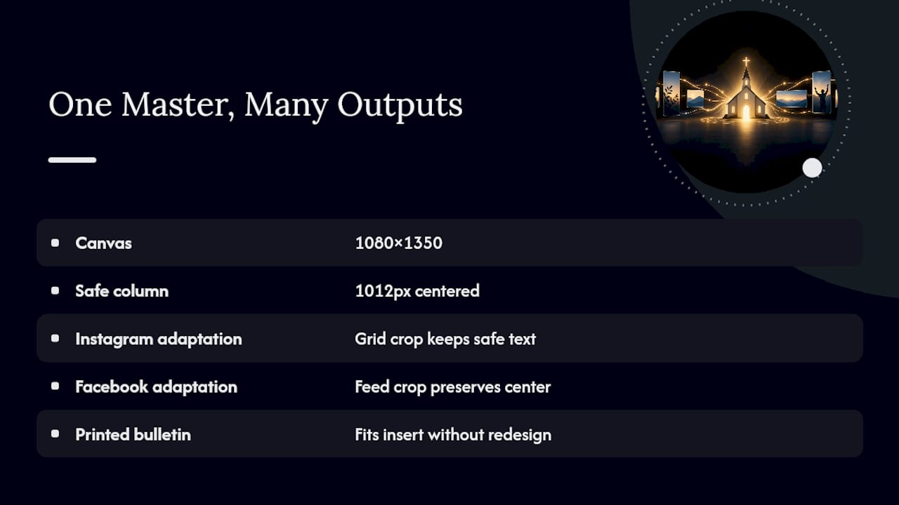
A template system built around one centered safe zone, rather than a different layout for every platform, is what actually saves volunteer time. Design your sermon-series art, event banners, and announcement graphics once at 1080×1350, keep the essential text inside the 1012px safe column, and that same file adapts to Instagram's grid crop, Facebook's feed, and even a printed bulletin insert without a redesign.
Governance matters just as much as pixels. The USCCB's social media guidelines recommend at least two administrators per official account, a shared and centrally stored password record, and a short public posting policy that reflects charity and respect in how the parish engages online. That structure protects continuity when a volunteer graduates or moves away.
Editable kits can be built around workflows using 2× masters, centered safe zones, and layered files accessible for volunteers without design backgrounds. A quick five-item pre-publish checklist covers most of it: correct size, crop preview, alt text, second-admin approval, and a confirmed schedule time.
Why Consistent Sizes Matter More Than People Think
Correctly sized, sharp graphics are often the first impression a visitor has of your church, long before they walk through the door. A stretched banner or a cropped sermon title reads as an oversight, and it undercuts the trust you are trying to build. Pastoral guidance on social engagement has long emphasized discernment and intentionality over reactive posting, and that starts with something as unglamorous as building your templates the right size the first time.
— Benjamin
BNJMN Digital Kits Built Around These Exact Sizes
Getting sizing right every week is where most volunteer teams lose momentum, not because the specs are complicated, but because rebuilding templates from scratch eats up hours nobody has. BNJMN Digital's Church Content, AI & Productivity, and Backgrounds & Design product lines are built to close that gap directly.
Each social media kit ships with masters already sized for Instagram, Facebook, and YouTube, with the centered safe zone baked into the template so your sermon-series art survives the grid crop without redesign. The files are editable in open formats, so no volunteer needs a paid subscription to update a date or swap a photo. If your team is ready to stop rebuilding graphics from zero every season, browse the current kits and backgrounds at Bnjmndigital and download a sample to see how the safe zones hold up on your own screen.
Sources
- Instagram Post Size 2026: What to Post After the Grid Change
- Instagram Post Size Guide 2026: Every Format and Safe Zone
- Social Media Guidelines | USCCB
- Image and video guidelines — Catholic Social Media
FAQ
What Is the 5:3:2 Rule for Social Media Posts?
It's a content mix guideline suggesting roughly five shares of others' relevant content, three original posts about your own ministry, and two personal or lighter posts for every ten pieces published. Churches often adapt it loosely rather than following it as a strict formula, since sizing and consistency matter more than hitting an exact ratio.
What Is the 80% Rule for Churches on Social Media?
The general idea is that around 80% of a church's posts should focus on serving, encouraging, or informing the congregation and community, while a smaller share promotes events or asks for something directly. It is a content balance principle, not a technical or legal standard, and works alongside correct church social media sizes rather than instead of them.
What Are the Best Social Media Platforms for Churches?
Most churches see the strongest engagement on Facebook and Instagram, since both skew toward older and middle-age congregants who already use them daily. YouTube matters heavily for sermon archives and livestreams, while TikTok and Reels are worth adding if your church wants to reach a younger audience with short vertical video.
What Size Should a Church Facebook Cover Photo Be?
The standard Facebook cover photo displays at 820×312 pixels on desktop, though mobile devices crop the sides more tightly. Keep your church name, logo, or key text centered in the middle so it survives both the desktop and mobile view without getting cut off.
Does BNJMN Digital Offer Templates Already Sized for These Platforms?
Yes. Some editable social media kits include masters pre-built for Instagram, Facebook, and YouTube with centered safe zones for grid and thumbnail crops. Current products and pricing are listed on the BNJMN Digital site.